

The world of interior design often moves in cycles. What once felt nostalgic suddenly returns with a fresh, modern twist. One of the most fascinating examples of this design revival is the rise of Miami Vice colors in contemporary homes. Inspired by the iconic 1980s television series and the vibrant nightlife of Miami, this color style blends pastel tones, neon accents, and coastal vibes into a bold yet balanced visual experience.
Back in the mid-1980s, designers and pop culture began embracing pastel colors combined with neon highlights, a trend often referred to as the “Miami Vice effect.” This aesthetic brought back the soft pastel shades of the 1950s but paired them with electrifying pinks and blues, creating an energetic visual identity that defined an era.
Today, interior designers are rediscovering the charm of this style. The miami vice color palette represents a mix of tropical energy, retro nostalgia, and modern minimalism. It captures the spirit of beach sunsets, neon lights, and ocean breezes all at once.
What makes this palette so captivating is its ability to balance boldness with softness. On one hand, bright neon pink and electric cyan deliver visual excitement. On the other hand, neutral tones like white, grey, or black keep the palette grounded and sophisticated. When used correctly, Miami Vice colors can transform a room from ordinary to unforgettable.
This style is particularly appealing for modern homes because it offers something rare in interior design: personality. Instead of neutral beige or predictable greys, homeowners are experimenting with vibrant colors that reflect creativity and individuality.
The result? Spaces that feel alive, energetic, and undeniably stylish.
What Is the Miami Vice Color Palette
The miami vice color palette revolves around a distinctive combination of pastel neon hues inspired by tropical sunsets, ocean waters, and city nightlife. The most recognizable elements of the palette include bright pink, turquoise, cyan blue, and neutral balancing shades like white or black.
Design resources often describe the classic Miami Vice palette with colors such as cyan (#0BD3D3), pink (#F890E7), white, and black. These shades together create a visual contrast that feels both playful and elegant.
Key Colors in the Miami Vice Palette
| Color | HEX Code | Design Meaning |
|---|---|---|
| Cyan Blue | #0BD3D3 | Represents ocean freshness and energy |
| Neon Pink | #F890E7 | Adds vibrancy and retro personality |
| White | #FFFFFF | Keeps interiors bright and balanced |
| Black | #000000 | Provides contrast and modern depth |
These colors create what designers call a miami vice color scheme, a blend of tropical brightness and urban nightlife aesthetics.
Pink, Cyan, and Neon Accents Explained
The real magic of this palette lies in how these colors interact with each other. Pink represents warmth and creativity, while cyan and turquoise evoke ocean calmness. When these shades meet, they create a dynamic contrast that feels exciting yet harmonious.
Designers often describe this combination as a visual sunset. Imagine standing on a Miami beach as the sky turns pink while the ocean reflects shades of blue. That’s essentially the emotional effect the Miami Vice palette brings into interior spaces.
Another interesting aspect of the palette is how flexible it can be. While pink and blue remain the stars of the show, designers frequently introduce additional shades like lavender, teal, or coral to add variety.
This versatility allows homeowners to experiment freely without losing the retro vibe that makes Miami Vice design so recognizable.
The Miami Vice Color Scheme in Interior Design
Using a miami vice color scheme in interior design may sound bold, but when applied thoughtfully it can create stunning living spaces. Modern interior design often relies heavily on neutral tones, which can sometimes make rooms feel sterile or predictable. Miami Vice colors break that monotony by introducing personality and movement.
Interior designers often start with a neutral base such as white walls or light wood flooring. Against this calm background, bright pink and turquoise accents instantly come to life. The contrast is what makes the design visually engaging without feeling overwhelming.
Another reason this palette works so well is its connection to tropical environments. Colors like turquoise and cyan naturally remind us of ocean water and clear skies. Psychologically, these colors can create a sense of relaxation and openness.
Pink tones, on the other hand, add warmth and friendliness to a space. When used sparingly, they bring an uplifting atmosphere that encourages creativity and conversation.
Interestingly, many designers compare the Miami Vice palette to modern vaporwave aesthetics. Both styles rely on neon tones and pastel contrasts to create futuristic yet nostalgic visuals.
The result is an interior design approach that feels both retro and contemporary at the same time.
And that’s exactly why this trend continues to gain popularity in modern homes.
Exploring the Miami Vice Blue Color
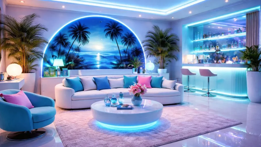
Among all the shades in the palette, the miami vice blue color plays one of the most important roles. This bright cyan or turquoise shade represents the ocean energy of Miami’s coastal environment. It’s fresh, vibrant, and incredibly versatile in interior design.
From an aesthetic standpoint, this blue shade sits somewhere between pastel and neon. It has enough brightness to stand out but still feels soft enough to use across large surfaces.
How Miami Vice Blue Shapes Interior Atmosphere
Blue is widely known as a calming color. It promotes relaxation and clarity, which makes it ideal for spaces like living rooms, bedrooms, and home offices. When used in the Miami Vice palette, the blue becomes even more dynamic because it contrasts with warm pink tones.
For example, a turquoise accent wall combined with pink furniture instantly creates a bold visual statement. Yet because both colors share a pastel softness, the room never feels too intense.
Another advantage of Miami Vice blue is its compatibility with modern materials like glass, chrome, and acrylic. These materials reflect light beautifully, enhancing the neon-inspired glow that defines this aesthetic.
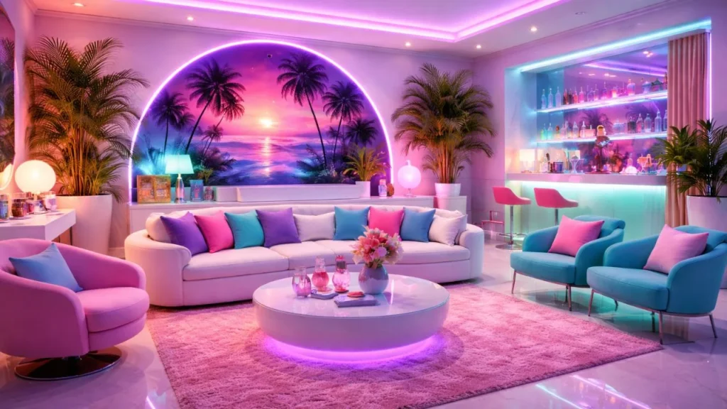
Best Combinations with Miami Vice Blue
The miami vice blue color pairs beautifully with several complementary shades:
- Neon pink
- Coral
- Lavender
- White
- Soft grey
These combinations help designers build layered color stories within a space.
Imagine a living room with a turquoise sofa, pink cushions, and white walls. Add a chrome coffee table and soft neon lighting, and suddenly the entire room feels like a stylish Miami lounge.
That’s the transformative power of the Miami Vice palette.
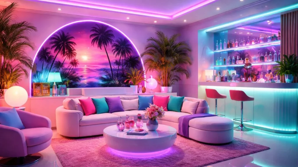
How to Use Miami Vice Colors in Living Rooms
The living room is often the best place to experiment with bold color palettes. Since it serves as the central gathering space in most homes, it’s the perfect canvas for showcasing vibrant design ideas.
When applying Miami Vice colors in a living room, designers usually focus on accent elements rather than full color saturation. This approach allows the palette to stand out without overwhelming the space.
A popular design strategy is creating an accent wall using turquoise or pastel pink paint. Pairing that wall with neutral furniture instantly creates a striking visual contrast.
Another approach involves colorful furniture pieces such as sofas, lounge chairs, or ottomans. A pink velvet chair against a white background can become the focal point of the entire room.
Lighting also plays a crucial role in this design style. Neon lights, LED strips, or soft pastel lamps enhance the retro vibe and help highlight the color palette.
Decor elements such as tropical artwork, abstract prints, or even a subtle line flower illustration can tie the theme together while providing opportunities for internal design storytelling within your home decor blog.
The goal is not to recreate the 1980s literally but to reinterpret its energy in a modern context.
Miami Vice Bedroom Design Ideas

Bedrooms offer another exciting opportunity to explore Miami Vice colors. Because bedrooms are more intimate spaces, designers often use softer pastel versions of the palette.
A typical Miami Vice bedroom might feature blush pink bedding paired with turquoise throw pillows. White walls help balance the bold tones, while warm lighting softens the overall look.
Textures are especially important in bedroom design. Velvet cushions, silk curtains, or soft cotton linens add depth to the color palette. These textures also prevent the room from feeling flat or overly synthetic.
Another popular idea involves neon signage or soft LED strips behind the bed headboard. This lighting technique creates a glowing atmosphere reminiscent of Miami nightlife.
Wall art can also play a major role in reinforcing the theme. Tropical landscapes, sunset photography, or geometric prints complement the Miami Vice palette perfectly.
The result is a bedroom that feels stylish, playful, and relaxing at the same time.
Combining Miami Vice Colors with Modern Minimalism
One of the most interesting trends in contemporary design is the fusion of retro color palettes with minimalist architecture.
Minimalism focuses on simplicity, clean lines, and uncluttered spaces. When combined with Miami Vice colors, it creates a striking balance between calm and excitement.
For example, a minimalist living room with white walls and simple furniture can instantly transform when a few bold accents are introduced. A turquoise rug, pink artwork, or neon lighting element can completely redefine the room’s atmosphere.
This approach works particularly well in modern apartments where space is limited. Instead of filling the room with decorations, designers use color strategically to create visual interest.
Another benefit of this combination is flexibility. If homeowners ever want to change the style, they can simply swap out colorful accessories without repainting the entire room.
This makes Miami Vice design surprisingly practical despite its bold appearance.
Best Materials and Textures for Miami Vice Interiors
Color alone does not define the Miami Vice style. Materials and textures play an equally important role in bringing the aesthetic to life.
Some of the most common materials used in Miami Vice interiors include:
- Chrome and metallic finishes
- Glass surfaces
- Acrylic furniture
- Velvet textiles
- Glossy lacquer finishes
These materials reflect light beautifully, enhancing the neon glow that defines the palette.
For example, a chrome lamp placed next to a turquoise wall can create stunning reflections that amplify the color’s intensity. Similarly, acrylic furniture allows bright colors to shine without visually cluttering the space.
Designers also recommend balancing glossy surfaces with softer textures like cotton or linen. This contrast keeps the room comfortable while maintaining the bold aesthetic.
The key is creating harmony between color, light, and texture.
Pros and Cons of the Miami Vice Color Scheme
| Pros | Cons |
|---|---|
| Unique and visually striking | Can feel overwhelming if overused |
| Perfect for retro or modern fusion interiors | Not ideal for extremely traditional homes |
| Encourages creativity in design | Requires careful color balance |
| Works well with neon lighting | Bright colors may fade faster in sunlight |
Understanding these advantages and limitations helps homeowners make smarter design choices.
Conclusion
The Miami Vice color palette is more than just a nostalgic tribute to 1980s television. It represents a bold, energetic design philosophy that celebrates color, creativity, and individuality.
With its signature mix of neon pink, turquoise, and pastel tones, the miami vice color scheme brings warmth, personality, and vibrancy into modern homes. Whether used through accent walls, colorful furniture, or glowing neon lights, these colors have the power to transform ordinary spaces into visually exciting environments.
What makes this palette truly special is its versatility. It can feel retro, modern, tropical, or futuristic depending on how it is applied. Pair it with minimalist furniture for a sleek contemporary look, or combine it with tropical decor for a playful beach-inspired atmosphere.
At its core, Miami Vice design invites homeowners to embrace color without fear. After all, homes should not just be functional spaces they should reflect the energy, creativity, and personality of the people who live in them.
And few color palettes capture that spirit quite like Miami Vice.